Accordions consist of a number of content panels, each of which can be expanded or collapsed vertically by the user.
Accordions help to save vertical space and reduce visual noise. Some accordions allow only a single panel to be expanded at a time, others allow multiple.
Before you continue, please read Tablist widgets (or: tab panels, tabs) to understand why accordions simply are extended variants of tablists, providing a slightly different layout and (sometimes) expandability of multiple panels.
Accordions and Tablists share the same underlying logic: a trigger (header/tab) controls the visibility of a content panel. While they are structurally similar, accordions have specific requirements:
Multiple panels can be visible at the same time (optional).
Keyboard support: Users can navigate between accordion headers using Tab and toggle them with Enter or Space. (Optional but recommended: Arrow key navigation).
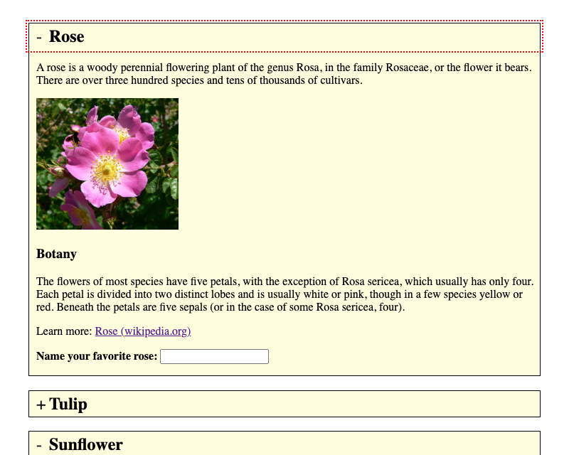
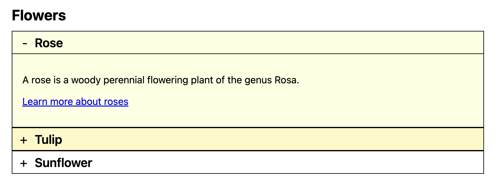
<p><button>Focusable element before</button></p><sectionclass="accordion-widget accordion"data-adg-accordion="flowers-accordion"><h2>Flowers</h2><divclass="accordion-item"><h3class="accordion-header"><buttonid="accordion_header_rose"class="accordion-trigger"type="button"aria-expanded="true"aria-controls="accordion_panel_rose"><spanclass="indicator indicator-open"aria-hidden="true">-</span><spanclass="indicator indicator-closed"aria-hidden="true">+</span>
Rose
</button></h3><divclass="accordion-panel"id="accordion_panel_rose"role="region"aria-labelledby="accordion_header_rose"><p>A rose is a woody perennial flowering plant of the genus Rosa.</p><p><ahref="https://en.wikipedia.org/wiki/Rose"target="_blank">Learn more about roses</a></p></div></div><divclass="accordion-item"><h3class="accordion-header"><buttonid="accordion_header_tulip"class="accordion-trigger"type="button"aria-expanded="false"aria-controls="accordion_panel_tulip"><spanclass="indicator indicator-open"aria-hidden="true">-</span><spanclass="indicator indicator-closed"aria-hidden="true">+</span>
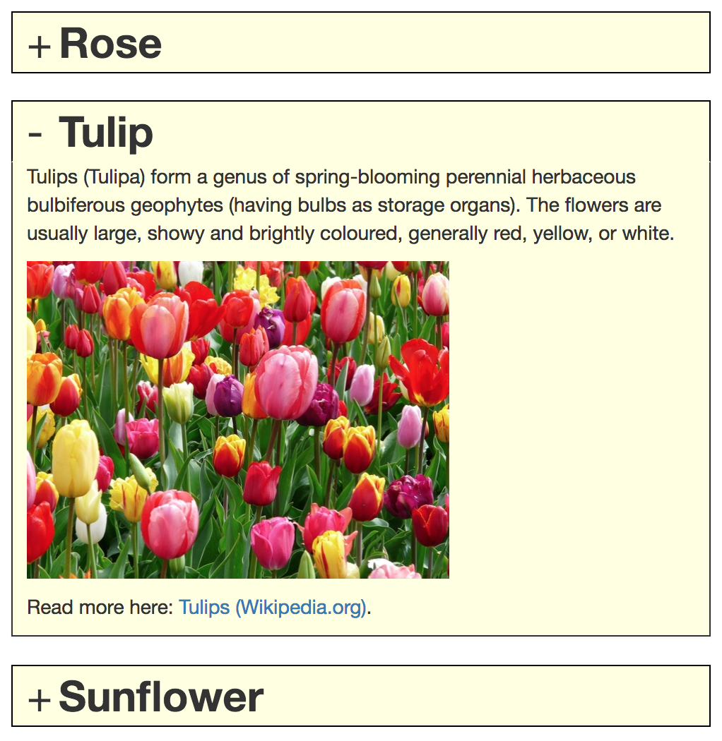
Tulip
</button></h3><divclass="accordion-panel"id="accordion_panel_tulip"role="region"aria-labelledby="accordion_header_tulip"hidden><p>Tulips are a genus of spring-blooming perennial plants.</p><p><ahref="https://en.wikipedia.org/wiki/Tulip"target="_blank">Learn more about tulips</a></p></div></div><divclass="accordion-item"><h3class="accordion-header"><buttonid="accordion_header_sunflower"class="accordion-trigger"type="button"aria-expanded="false"aria-controls="accordion_panel_sunflower"><spanclass="indicator indicator-open"aria-hidden="true">-</span><spanclass="indicator indicator-closed"aria-hidden="true">+</span>
Sunflower
</button></h3><divclass="accordion-panel"id="accordion_panel_sunflower"role="region"aria-labelledby="accordion_header_sunflower"hidden><p>A sunflower is a large annual plant.</p><p><ahref="https://en.wikipedia.org/wiki/Sunflower"target="_blank">Learn more about sunflowers</a></p></div></div></section><p><button>Focusable element after</button></p>
This implementation follows the current APG approach and uses a real button in each header.
The button toggles aria-expanded (true/false).
The button uses aria-controls to reference the associated panel.
The panel uses role="region" and aria-labelledby to expose a clear relationship back to the controlling header button.
The panel visibility is synchronized with the semantic state using JavaScript.
Native HTML Disclosure Elements
For simple disclosure-like use cases, the native HTML <details> and <summary> elements are a solid, no-JavaScript option. You can find the technical specification and browser behavior in the MDN Web Docs for the Details element.
The summary element works as the interactive header.
The surrounding details element manages the expanded/collapsed state natively.
This removes the need for JavaScript compared to custom ARIA widgets.
<p><button>Focusable element before</button></p><sectionclass="accordion-widget accordion"><h2>Flowers</h2><detailsclass="accordion-item"open><summaryclass="accordion-trigger"><spanclass="indicator indicator-open"aria-hidden="true">-</span><spanclass="indicator indicator-closed"aria-hidden="true">+</span><h3class="accordion-header">Rose</h3></summary><divclass="accordion-panel"><p>A rose is a woody perennial flowering plant of the genus Rosa.</p><p><ahref="https://en.wikipedia.org/wiki/Rose"target="_blank">Learn more about roses</a></p></div></details><detailsclass="accordion-item"><summaryclass="accordion-trigger"><spanclass="indicator indicator-open"aria-hidden="true">-</span><spanclass="indicator indicator-closed"aria-hidden="true">+</span><h3class="accordion-header">Tulip</h3></summary><divclass="accordion-panel"><p>Tulips are a genus of spring-blooming perennial plants.</p><p><ahref="https://en.wikipedia.org/wiki/Tulip"target="_blank">Learn more about tulips</a></p></div></details><detailsclass="accordion-item"><summaryclass="accordion-trigger"><spanclass="indicator indicator-open"aria-hidden="true">-</span><spanclass="indicator indicator-closed"aria-hidden="true">+</span><h3class="accordion-header">Sunflower</h3></summary><divclass="accordion-panel"><p>A sunflower is a large annual plant.</p><p><ahref="https://en.wikipedia.org/wiki/Sunflower"target="_blank">Learn more about sunflowers</a></p></div></details></section><p><button>Focusable element after</button></p>
// Native details/summary behavior requires no JavaScript for basic toggle behavior.
Implementation details
The panel lives in the default slot of <details> (no separate region role required for basic disclosure).
Each item uses <details> and <summary>; the open/closed state is exposed natively without aria-expanded.
Keyboard navigation: Browsers natively support Tab, Space, and Enter on the <summary>; arrow-key navigation between headers requires JavaScript.
Comparison: ARIA vs. Native HTML
Comparison of Implementation Methods
Comparison of Accordion Implementation Methods
Implementation Method
Advantages
Limitations
Custom ARIA Implementation
Full control over keyboard behavior (e.g. arrow keys).
Better for complex layouts/nested widgets.
Exact state control via JS.
Requires JavaScript for state and interaction.
Higher maintenance (must handle all ARIA states manually).
In Chrome with NVDA, if the virtual cursor is on an accordion button while keyboard focus is on a different element, activating the button can cause aria-expanded to be announced twice. No known fix exists.
Native Disclosure Elements (<details>)
Works without JavaScript.
Native accessibility "out of the box".
Minimal code footprint.
Limited styling options.
No native support for "only one open" (requires JS).
Default keyboard support is limited to Tab/Space/Enter.
Adding role="region" (and similar ARIA attributes) to content inside <details> does not work reliably; workarounds are needed for explicit regions.
Legacy implementations (Historical)
Note: The following legacy variants are deprecated and provided for historical reference only.
For all new projects, use one of the recommended implementations above (ARIA or native <details>/<summary>, depending on your requirements).